|
POLL: New TalkingPoker Banner
Option #1: The full "official logo" with the blue "expanding stars behind....
Option #2: The Talking Poker.com from the "official logo" without the orange star set over the blue expanding stars... |
You need to fix the inside of the "o" in ".com" - it should be transparent (blue in this case)...
These look good though. I think they are an improvement over the current logo. |
Yeah, I noticed that after they were posted. I will fix it up and send you the final one when one is chosen.
|
Ok, who voted for #4???? :p
|
It's currently neck and neck between #2 and #3. Guess who gets to cast the tie-breaking vote? :D
Since #1 has less than 20% of the vote, there will definitely be a chance. Personally, I like the gold star, so I think we should go with that. Let's leave the poll up for another couple of days and see what the mojority thinks... |
I think that's enough voting. New logo with the star it is!
Please email me the corrected versions BB.... You don't happen to do any work with Flash, do you? |
Great, my new hat is obsolete already :mad: .
|
Do you need both, or just the one with the star? I'll send JPG and PSD files a little later (at work...).
|
Go ahead and send both?
|
How do you figure? The site is finally going to look like your hat!
|
Oh, in that case, I'll shhhhh.
|
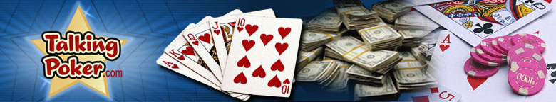
Tada!
TP.com has a new look. I like it. Thanks, Blibbity :) |
| All times are GMT -4. The time now is 04:22 AM. |
Powered by vBulletin® Version 3.8.1
Copyright ©2000 - 2024, Jelsoft Enterprises Ltd.
©2004-2008 TalkingPoker.com