|
|
|||||||
| View Poll Results: What do you think banner should be.... | |||
| Keep the existing one....I love the status quo! |
|
3 | 15.79% |
| Option #1 (w/ orange star) |
|
9 | 47.37% |
| Option #2 (Just the text) |
|
6 | 31.58% |
| I really don't like any of these and I will be happy to put together something better.... |
|
1 | 5.26% |
| Voters: 19. You may not vote on this poll | |||
 |
|
|
Thread Tools | Display Modes |
|
|
|
#1
 07-25-05, 09:58 PM
|
||||
|
||||
|
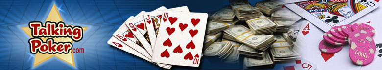
You need to fix the inside of the "o" in ".com" - it should be transparent (blue in this case)...
These look good though. I think they are an improvement over the current logo. |
|
#2
07-25-05, 10:02 PM
|
||||
|
||||
|
Yeah, I noticed that after they were posted. I will fix it up and send you the final one when one is chosen.
|
|
#3
07-26-05, 02:29 PM
|
||||
|
||||
|
Ok, who voted for #4????

|
|
#4
07-26-05, 02:45 PM
|
||||
|
||||
|
It's currently neck and neck between #2 and #3. Guess who gets to cast the tie-breaking vote?
 Since #1 has less than 20% of the vote, there will definitely be a chance. Personally, I like the gold star, so I think we should go with that. Let's leave the poll up for another couple of days and see what the mojority thinks... |
|
|
|


 Hybrid Mode
